
 I’ve liked Diigo for a long time. (Here’s a post from 2009 and another from 2012.) In fact, I used to be (a tad) obsessed with Diigo.
But then, something happened, and Diigo wasn’t being developed as consistently, and I lost interest as glitzy social clipping services like Pinterest and Snip.it and Bundlr and Scoop.it came along and made Diigo look so, well, ordinary.
But now, I’m happy to report, Diigo is back. And so am I.
Most impressive is Diigo’s site redesign. It’s a major overhaul. Gone is the clutter. The look is clean and clear. Here’s my library dashboard:
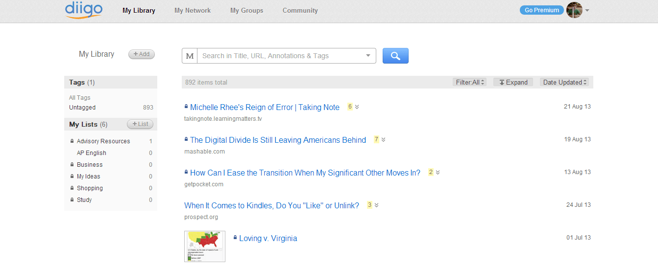
If you take a closer look, you can tell that the developers took extra care with details. For example, the number of annotations for each clip is highlighted next to the title. You can expand or collapse your annotations.
Better yet, the new search bar works extremely well. The default (see the M?) is called “Meta Search,” which locates search terms both in post titles and annotations. It’s so good that I made the big decision to get rid of tags altogether. Tags weren’t helping me organize my clips very well, and I figure that I can use Diigo lists if I want to curate and save a “best-of” collection. If you don’t like the Meta Search, you can also search by tags or by full text (if you have Diigo Premium.)
Diigo has also improved its already-excellent Chrome extension. Seriously, this is one of the most useful extensions out there. Here are some of its features:
- Save a webpage to Diigo,
- Annotate a page,
- Save the page to read later (I prefer Pocket),
- Take a screenshot (genius),
- Share the page via Twitter, Facebook, Google+, Gmail, or an annotated link.
I can’t say enough good things about the extension. No other service allows you to annotate the Internet as smoothly as Diigo does. Once you start highlighting or taking notes, up comes the “Annotation Toolbar,” which lets you change the highlight color and write a sticky note. Or you can reorganize the clip by changing the title, adding tags, and sharing to a list or a group. (I could do an entire post just on these features. Yeah, maybe I will!)
As a teacher, the only problem I see with Diigo is that I don’t see it working seamlessly with students (despite Diigo’s “teacher console,” which makes it easy for teachers to create and manage class groups). It’s just a little too advanced and too text-heavy. Once students get used to reading and researching a lot (maybe in the 11th and 12th grades?), they probably would see the many benefits of Diigo. But because Diigo lacks a strong phone app (particularly on Android, where Power Note is only mediocre), it just won’t fly with the average student. Students (and many adults) are too attracted to big and beautiful images, and though I don’t want Diigo to emulate Pinterest, it wouldn’t hurt to move at least a little in that direction.
I can’t wait to see where Diigo heads next. It has tons of users and a huge amount of potential. In the meantime, I’ll be playing around with Diigo, experimenting with it, and doing a whole lot more highlighting and annotating. If you use Diigo or try it out, please let me know what you think!
well done diigo for your fancy work BUT you still haven’t realized your fan’s most wanted feature : “Organise your bookmark list like yours os, in differents folders” -1608 votes on the forum by far the most wanted feature!!! Nice approach…. Ignore the majority!
Hi irolf, thanks for your comment, though I don’t work for Diigo! Maybe Diigo is interested in keeping its tagging infrastructure instead of going in the direction of Evernote. But not sure, of course.
I was in a conversation last week with someone who wanted to put a Google Doc in multiple folders, and I was thinking that it would awesome to have both folders and tags. A site could live in a folder for aesthetic reasons and be searchable by tags for usability.