In today’s Washington Post, reporter Jonnelle Marte summarized a new study, conducted by researchers at the University of Miami, that indicates that there is a direct correlation between grade point average in high school and future annual income.
This conclusion isn’t earth-shattering. But take a look at this crazy graph:
Can this be true? Is it possible, really, for the relationship to be so intensely linear?
The researchers, including Michael T. French, director of the health economics research group, think so. They surveyed about 10,000 people in their early-30s and consulted high school transcripts to confirm grade point averages. For every point a GPA went up, men earned 12 percent more and women earned 14 percent more.
Side note: Not surprising that the graph above has two bars, one for men and one for women. As stark as the linearity of the graph is the earnings gap between men and women.
After getting over my initial shock, my second thought is whether to use this graph with students (and if so, how).
My gut says yes. You see, students, your grades really do matter! Look at this graph!
But a few things make me think twice. One concern is that students won’t think this data applies to them. Teenagers are notorious for thinking that they’re unique. Which of course they are. Even if I explained that the graph represents 10,000 unique individuals, students wouldn’t necessary buy it.
Another worry is the reverse: that students will believe that this graph represents cause and effect. “Mr. Isero, my GPA is 1.5. Are you telling me that all I can make is $30,000 a year? I might as well drop out.” Sometimes, provocative images and graphs can lead to negative consequences, no matter how much explanation a teacher offers.
One wish I have about this graph would be to add educational attainment into the mix. For example: What percentage of students with 1.5 GPAs have college degrees? What happens to your income if you have a 1.5 GPA and a college degree? What if you don’t get a college degree?
I’d love to hear your thoughts about this graph. Would you use it? If so, how? I can’t wait to read your brilliant insights!
There’s a big new trend happening in the news industry, and it’s called explanatory journalism. Also known as data journalism, it’s the recent fad to shun the typical news cycle, in which sound bites and juicy tidbits rule, and instead focus on delivering the story through data and analysis.
Nate Silver, the founder of FiveThirtyEight, and Ezra Klein, founder of Vox, are the hot names behind explanatory journalism. They believe that typical news is biased and doesn’t give readers the whole story of what’s going on.
I agree. When it comes to offering background information — the key knowledge necessary to aid your comprehension — news articles are not the best genre.
I remember my first semester at college, having just subscribed to The New York Times, and trying to read news articles on the Israel-Palestine conflict. Because I wasn’t an expert on the history, I was lost. It took me a couple months of reading the paper to get enough of the back story.
The same can be said for most high school students. You may want them to be able to pick up Time Magazine and read it cover to cover, but for most of them, it’s not going to happen without some help. Students are fine with local articles. But once things go national (and wow, international), background knowledge deteriorates, and boredom-by-ignorance sets in.
That’s why I like Vox. Its motto is “Understand the News.” And the bulk of its site is a feature called “Cards.” Important topics — like Benghazi, Ukraine, and income inequality — are explained in a series of cards, called stacks. A question begins each card. It’s perfect for students to gather enough information to feel like they belong.
Let’s take a tour of a couple cards in the stack, “What is Obamacare?” Here’s part of the first card:
You’ll notice that there is a real person, not a computer or atomizer, who is writing these cards. And you’ll see the abundant use of highlighter yellow, which makes me happy. Along the left is a navigation bar if you want to skip through to a new question. And along the top you’ll see that there are 32 cards in this topic.
There’s nothing exciting about these cards — no big videos pop out, and there’s no music. Which is fine by me. Remember, there’s nothing wrong about reading, right?
Here’s just one more card in the stack:
This one is a good example of Vox’s emphasis on charts. They’re not as big on data as FiveThirtyEight, but they’re less annoying (and less about sports). It’s sometimes good to see visual representations of information.
Using Vox With Your Students
I can see a lot of ways that teachers can use Vox with their students. Here are a couple. Please add more in the comments!
1. Vox as Clarifier Let’s say that you have your students read an article about Obamacare in The New York Times or on Newsela. You give the article to your students cold, and you direct them to monitor their understanding. As Kelly Gallagher likes to say, you prompt your students to “mark their confusion.”
But instead of immediately filling in your students’ knowledge gaps, you tell them to write down clarifying questions. You don’t answer them. Instead, you have your students go to the Obamacare card stack on Vox.
What will likely happen is that your students will realize that some of their questions are similar to the questions on Vox. After shuffling around and reading some cards, students can share how the background information helped their understanding of the original article.
2. Student Vox
Vox has some great card stacks, but it’s still a new site. That means that your students should make some stacks, too!
There are a few ways of doing this:
Students take an existing Vox stack and add additional cards. This isn’t too fun, but it would be a good way to start out.
Students do a Vox stack based on a personal interest, like skateboarding or quinceaneras.
Once they get the hang of it: Students choose an important current event, follow it for a month or so, come up with key questions that everyone should know, and develop a Vox stack on Google Sheets or something similar.
I like the idea of encouraging students to make something, instead of just consuming current events. The best reading (the best learning, too) comes with producing something new.
So there you have it. Vox is a great way to remind your students that news isn’t just something that randomly happens every day. Each current event is part of something bigger — it’s a piece to a larger puzzle.
Please check out Vox and let me know if you think it’s useful for students. If you have ideas for using Vox, please offer that insight, too. Thank you!
When you have 10 minutes, please watch this excellent short film, “Why Libraries Matter,” about the New York Public Library. It’s by Julie Dressner and Jessie Hicks.
There are tons of great moments. My favorite: Isaiah, 9, who asks the librarian for “science books,” and later clarifies that he really means books about “mummies.”
That was great, right? I’d love to hear your thoughts. What was your favorite part?
Paul Tough knows how to write. He writes so well, if he wrote about marmalade, I’d read it, no problem. Barnacles, too. Give Mr. Tough a topic, any topic, and he’ll churn out a must-read.
His latest piece, “Who Gets to Graduate?” in this Sunday’s New York Times Magazine, is an article that every urban educator should read. Thanks to loyal Iserotope reader Michele for recommending it!
I don’t want to give too much of it away, or else you won’t read it, but Mr. Tough makes three major claims: (1) Poor students are less likely to graduate from college than rich students, (2) One key reason for this is that poor students don’t feel like they belong and then freak out in college when they experience setback, (3) There are easy ways for schools to intervene so that poor students feel like they belong and remain resilient through challenge.
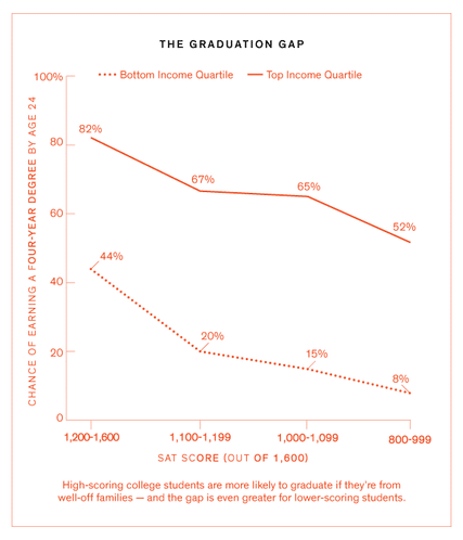
All right, now just a little bit more on a couple points. First up, the college graduation gap. Please take a look:
My eye goes to two numbers: the 52% on the top quartile line and the 44% on the bottom quartile line. If I’m reading this graph correctly, if you score really high on the SAT but are poor, your likelihood of graduating is less than someone who scores really low on the SAT but is rich. In other words: Your class background matters more for college graduation than your reading and Math skills.
This looks overwhelming, right? It makes you want to act like Diane Ravitch and say that poverty trumps all, that nothing can happen to close the achievement gap until our country solves poverty, right?
But wait. Mr. Tough offers tons of hope. The answer is what David Yeager and his colleagues are doing at the University of Texas at Austin. Mr. Yeager comes from a long line of Stanford professors, including Carol Dweck and Claude Steele, who believe that the mindsets of young adults matter. When students feel they belong, and when they feel like obstacles do not compromise their academic ability, they persist and succeed.
Here’s what Prof. Yeager believes:
Ultimately a person has within themselves some kind of capital, some kind of asset, like knowledge or confidence. And if we can help bring that out, they then carry that asset with them to the next difficulty in life.
To test those beliefs, Prof. Yeager conducted a large-scale experiment on incoming freshmen at UT Austin. Students in the experimental group completed a 25- to 45-minute online module that involved a short reading and writing exercise. The results were stunning. More poor students than ever before did well in school their first semester, passing more classes, completing more units, and starting off strong toward graduation.
Getting these excellent results after a fairly quick intervention is bringing out doubt from Prof. Yeager’s colleagues. Is this really possible? It seems so easy! Apparently, according to several similar studies, it is.
And that’s what makes me hopeful. The most crucial step, Mr. Tough suggests, is to message loud and clear to students that they belong and that they are valued. Too often, teachers — grizzled and jaded from too many years of struggle — present a deficit model to their students. If that occurs, then the gap will continue.
But if we send a positive message, and interrupt deficit mindsets, change is possible. There’s no simple answer, of course, but not everything has to be difficult.
Now, your homework: Please go read this article (it’s also on Iserotope Extras!) and let me know what you think. For example: Do you believe that it’s OK to tell students the truth, or do you agree with “the first rule of the Dashboard?” Thank you!
 In today’s Washington Post, reporter Jonnelle Marte summarized a new study, conducted by researchers at the University of Miami, that indicates that there is a direct correlation between grade point average in high school and future annual income.