
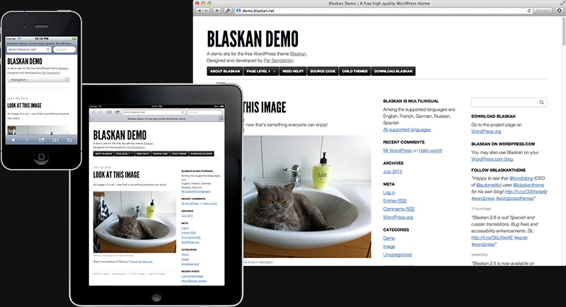
I wanted something simple and clean and professional and a little more modern and confident. After trying about 30 WordPress themes, I chose Blaskan, by Per Sandstrom. (My new housemates are Swedish, so maybe this was meant to be.)
I’m proud to say that I made a few modifications to the theme without breaking the site entirely, which has happened in the past.
The biggest change is that I chose a serif font, Old Standard TT, instead of the default Helvetica Neue. There’s nothing wrong with Helvetica, but my print journalism roots make me lean serif. Plus the Helvetica was huge and overbearing, which is no good.
Then I played around with column widths and the number of columns, and although the trend in blog design is toward expansive one-column themes (see Medium), I opted to keep my sidebar. (It has fun extras.)
My favorite part of this new look is how much white space there is. Yeah, maybe there’s too much, but I like the confident minimalism.
I’m still making some tweaks here and there, and I’d love to hear your thoughts. Maybe you don’t care at all and would rather I just write more. Or maybe you care a lot one way or the other. Please let me know by leaving a comment!